Thursday 14 September 2017

Android UI Patterns blog is moving

..to Medium.

Hey everyone! Just a quick post here informing that I will be moving the Android UI Patterns to the Medium platform.

You can already find the new blog here: https://medium.com/android-ui-patterns including two new posts that I've done in the last couple of weeks!


It feels like it's time to let Blogger go as the platform. Google has long neglected Blogger and while technically still working I'd not be surprised if the upcoming spring cleaning will take this away.

Blogger is also visually fairly poor and running a UI blog that looks like this might not be the best thing to do..

So. In the coming weeks I will be pointing the www.androiduipatterns.com domain to the Medium publication. However, any RSS subscriptions are likely to stop working. You can start following the publication or me on Medium in the meanwhile so all the content will still be delivered to you :-)

Juhani

Monday 16 January 2017

Couple of Great Apps for Designers

I wanted to give a quick shout out to two Android apps that designers and app UI developers might find very useful in their work.

https://play.google.com/store/apps/details?id=com.scheffsblend.designertools

Designer Tools package multiple helpful features into one app. You can can use a grid overlay to check your component alignment, you can overlay your screen with a semi-transparent mock overlay to see how your implementation matches the design and you can use a colour picker to extract the colour value of any pixel on your screen to confirm that the colours are set correctly. Additionally you can enable a screenshots details mode which will automatically augment your screenshots with device details. This will become very useful when reporting issues to developers!

This app is also Open Source and the dev team is actively looking for feedback and thoughts. Check out the code from GitHub or give feedback, report problems or suggest improvements.


https://play.google.com/store/apps/details?id=com.faizmalkani.keylines

Faiz's Keyline Pushing app is, as far as I know, the first app that brought us the keyline overlay easily. While this app doesn't have the rest of the features of the Designer Tools app discussed above this app provides much finer controls for keylines.

Personally, I'd love to see Keyline Pushing app's finer grid control implemented also in the Designer Tools app. Faiz, maybe joining forces with the Designer Tools team would make sense? ;-)


Huge thanks to both of the app teams! Android developer and designer community is amazing. Many of us spend our free time to make everyone's work easier.


Monday 22 February 2016

Android as a Prototyping Platform - a Case Study

I've not been writing much lately here. The reason is twofold:
1) Android has gotten much better lately and there's much less to complain about. Companies are starting to understand the value of understanding Android design and doing it right. Well.. mostly.. What's up with the new G+ app??
2) And this is the big one. I've been working to turn my long time passion hobby project into a real product. Me and my friends have been working on a new type of hybrid miniature game called Lands of Ruin which combines two of my passions. Android and miniature gaming!

We're currently running a Kickstarter campaign for the Lands of Ruin project. Check out the campaign here:
https://www.kickstarter.com/projects/landsofruin/lands-of-ruin-hybrid-tabletop-gaming-as-it-should


Anyways, this post is not just a marketing blurb about our Kickstarter (although all support and sharing is much appreciated!).

During the last 3+ years I've been building the digital part of Lands of Ruin as an Android app prototype. It turns out that Android is an amazing platform for rapid prototyping simply by using native code!

Background - Process

Before I jump into explaining how we did what we did let me first explain what it is that we're doing. 

Lands of Ruin is a tabletop miniature game with a companion tablet app (is that the geekiest thing you've ever heard or what?). It is also something that has not been done before. While there's been couple of hybrid gaming attempts they have been very different nature. In short, what we wanted to is to create a smooth interaction between the physical game and the digital world. How do you do something like that? We had no prior examples we can pull from or ideas to copy. We had to create the interaction from scratch.


Step 1 - Paper

Like on any great design project everything always starts with pen & paper. Pen and paper is an invaluable tool for rapid prototyping. You get an understanding what is needed without having to write any code. And best of all you can do it together with others. Two heads is better than the sum of its parts!

In our case the earliest paper prototypes didn't even try to represent tablet UI. Instead with the pen and paper combination we explored what needed to be tracked and what needed to be automated. Even talking about user interfaces at this point would have been way too early. First, we had to figure out "what" before we could start talking about the "how".


Unfortunately, I don't have any of the early paper experiments left so I could show you. But in short they mostly reminded spreadsheets on paper.

Regular iterations

Very quickly at the beginning of the project we understood that we had to iterate a lot. We had to establish a working routine that worked for an after-work-hobby project. To us the solution was to set a certain night of the week aside for play testing. We decided on Thursday nights and that became the routine for the next 3 years. Every Thursday we played a game with the current prototype and after the game we discussed ideas of improvements and what to do next. Then we set the goals for the next Thursday and separated. We worked through the week to achieve the set goal as well as had brainstorming sessions (usually in a bar) to solve problems we ran into during the week. That has worked really well!

Not-so-coincidentally we still play every Thursday. Nowadays the game night is usually for guests who come to play the game into our office and enjoy a beer or two. The improvement interactions are still there though. Problems found during these game sessions are noted and hopefully fixed before the next Thursday.


Step 2 - Functional "What" Prototype - or Proof of Concept

After the initial paper phase I wrote the very first Lands of Ruin companion app. At this point very little thought was spent on the UI and how it should function. The first prototype was still for understanding what the app needed to do.

When building something completely new there's one question that is worth answering: 
"why hasn't anyone done this before?"
There's approximately three answers to the question:
  1. It's a stupid idea and not worth doing.
  2. Nobody thought about it.
  3. The technology hasn't been there to do it before.


If you think the answer is #2 you're probably deceiving yourself. There's a lot of people on this planet. A lot of smart people, many of them smarter than you or me.

To answer the question we decided that we need a proof of concept. That's where the coding started and the result was this:

Now, the result was far from good UI or intuitive experience but that was never the aim of this prototype. This prototype allowed us to actually play the game for the first time. The limited ruleset and functionality of the app was well defined enough that it allowed us to elaborate how the complete product would feel. 

Another important step with this prototype was that we were able to get others to play the game. Naturally, the very first play testers needed a lot of help navigating the app and game itself but the experience was invaluable. We were able to get an understanding of the strength of the concept and decided to move ahead.

I spend around two weeks evenings coding this app. The UI was bare minimum but the core there. Game characters existed, actions were available to be performed and the players' tablets talked to each other over WiFi. 

Step 3 - Quick Prototype

Once we had a good enough understanding what we wanted to build it was worth starting to think how to build it. It was finally time to start thinking about the real UI. We had probably around 15 test games under our belts.

There were still many parts we didn't understand about the interaction. Especially tricky part was the connection of digital world and the tabletop. Our game design required that the app knew approximately where the characters were on the battlefield. 

We needed more information. The proof of concept prototype didn't provide us any way to test the most difficult design ideas. It was time to spend more time on the app.

This was the first time we sat down and drew what we wanted on paper. After quick pen & paper iteration it was time to open up Omnigraffle and draw something more concrete.


At this point it was no longer feasible to play the game with the paper prototype. The Omnigraffle wireframes were discussed in the team and the decision was that it was worth trying.

The result was this:

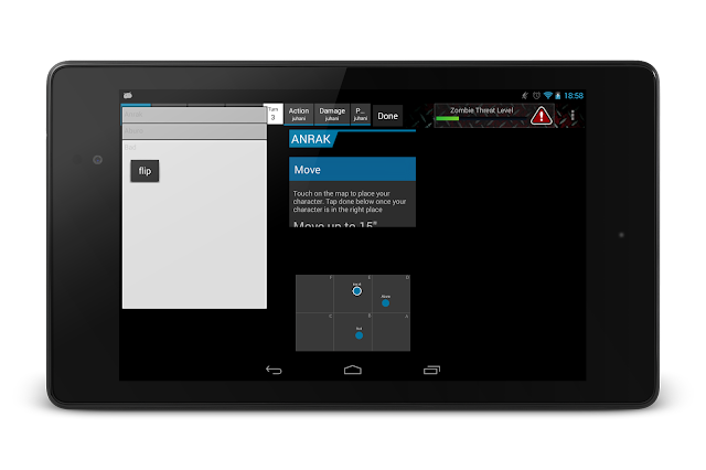
The app was still far from intuitive or beautiful but it had all the functionality the game required in graphical form. The game map was there and it worked. This was the very first time the game was played in the way we intended. We were now 6 months into the project.


Problems

Now that we had more fidelity in our prototype we started finally understand problems we had. While the solutions were still far away the first step was understanding the problem's cause.


At this point it became painfully clear that handing the characters wasn't easy or pleasant... and if an interaction in a game is not pleasant it's not really a good game at all.

We started iterating over the design. Not visually - but functionally. We wanted to find enough space on the small 7" screen to have all the components easily accessible. We added sliding drawers for more details and view pagers for easier access to the characters.

Here's one of the iterations:

And the next iteration:
And the next one:


We kept moving things around, changing sizes, rearranging them. Each step felt like we were closer to the goal. More and more playtesters came by to play the game and the feedback felt better after each game.

Fragments are awesome

At this point I want to point out one thing. Unlike you might have heard Android fragments are awesome and very powerful for prototyping.

Our game UI is completely native Android code still today. As an android developer that's what I know the best and that's the environment I get the best result fastest. Each part of the UI you see in the screenshots is an independent fragment. In the screenshot above there are 5-7 fragments visible at the time. Each fragment knows what they need to show and are subscribed to changes in the central game state. None of the fragments talk directly to each other. All communication is decoupled using an event bus approach.

This architecture allowed us to iterate extremely fast. The fragment showing a charter always knows how to display that character in the current gamestate no matter where it is located or what other fragments are visible.

This decoupling and event bus architecture allowed me completely change one part of the UI from one prototype to another without having to worry about breaking anything else as well as completely rearrange the UI and the game would remain playable from one build to another.


Step 4 - Design

We had finally enough test games and data that we wanted to take the next step. The current prototype was simply too ugly to show anywhere public. At the same time we saw an opportunity to go to a local maker event, Make Munich, to show the game to the public.

This was the kick we needed. We decided that the Make Munich event will be our launch event and we would put the app into the Google Play Store for closed beta and hopefully get more people outside our team to try the game. Bring in the Photoshop and visual design.

Rick, the artist in the LoR team, got the challenge to do our visual design. The resulting UI is here:

With this UI we proudly went to the Make Munich event and issued a press release telling about the release of the game. This was in the April of 2014.


Step 5 - Reality strikes back

After the Make Munich event we evaluated the response we got from the audience and from other play testers. There was no going around the fact that the game wasn't very good. There were several complex rule mechanisms that made the interaction difficult. The app UI was too clunky in many use cases forcing the players to focus too much on the tablet instead of the tabletop and the opponent. 

As one of our design principles was that the game MUST feel like a tabletop miniature game and the focus of the players should be on the miniatures, terrain and tabletop this was a clear state of failure.

We had failed on our design goals. What next?

Well. Back to the drawing board! It was still clear to us that the concept was viable but our implementation was bad. Something had to be done!

Even though we spent a lot of time on both asset production and design as well as on development we simply had to let go and scrap the current app version. It wasn't what we set to create.

Step 6 - Try something completely different

The big problem in the design was that the characters were difficult to access. 


We had couple of beers and brainstormed what could be done. An idea about drawers popped up and we decided to give it a try.

A complete reshuffle of the game UI ended up looking like this:


While the UI looks completely different the power of Android fragments actually allowed me to create this configuration in one evening. All the functional components were still same as before but where they were was different. Due to the fragment architecture and event bus approach no other changes was needed. The game was playable again the next day.


Unfortunately this wasn't good either and we ended up abandoning this approach very quickly.


Step 7 - Cards before cards were cool

The UI just didn't work. The game concept was kept back by the app. We didn't want to make more noise about our game as we weren't happy about the way it felt. It felt wrong. A radical new approach was needed. simple rearranging of component wasn't enough anymore.

Cards! A lot of tabletop games use cards to represent characters. Maybe a familiar concept would make more sense. There's also many games that handle digital cards. We can find the games we like and see how good interaction is done.

The first prototype with cards in non-functional state looked like this:

While we were in unplayable state at this time the concept felt promising. It felt like this could actually solve the issues we were having. It was worth putting the extra time in to see how this works as a game.

It worked! We were onto something. Week or two later when the game was in playable state we felt that things are finally starting to feel the way we wanted it to feel.


Step 8 - Making things look polished

We couldn't go back to releasing an app that looked like it was a complete prototype so after quick iterations with the card concept we decided to do proper design for visuals as well. Rick was forced into asset production mode again.

The first results were:
Finally! The app started to feel like it's close to what we wanted. In test games the difference was MASSIVE. The tablet has finally become secondary on the gameplay.. it has became an extension of the tabletop game we had. This was exactly what we set out to create!

This wasn't to say that the app was perfect but we were finally, after 3 years of development, getting there. This approach was worth polishing.

In the next iterations we changed the card orientation to better for the vertical stack we used and started providing more information to the players at the right time. 

Here's what we had:


Step 9 - Getting ready to launch

The app now had all the core features of our basic gameplay. We also have a good understanding how to build the advanced features we've been promising on top of this solid core. However, the visuals in the app weren't satisfactory.  Rick, who had done the assets until now, had his hands full on other tasks related to our impending Kickstarter and event demos.

We reached out to get support from abroad. We hired my girlfriend's sister Natalia Kovalchuk to get the game design up to par and in shape to be displayed in events and in Kickstarter.


Here is the result of this design iteration:


Step 10 - Kickstarter

And here we are. More than 3 years after the initial idea we are trying to get the game into public's attention. We're currently running a kickstarter campaign trying to fund creating the physical component of tabletop miniature gaming.. the miniatures.


Check out our Kickstarter promo video as well:
You can see the app in action in the video.


I would really appreciate if you'd also considered backing our Kickstarter campaign. Even if you're not a gamer dropping a £1 is actually very useful as Kickstarter likes to promote campaigns with higher backer numbers. But why not to get into tabletop gaming with Lands of Ruin? It's never been this easy! 

I much appreciate your support!

Please share our Kickstarter page link and help us to make our dream reality. 


I hope to get back to normal writing after the Kickstarter is over. There are couple of Android apps that have design that needs to get some attention!

Monday 10 August 2015

Splash screen with any other name is still a splash screen - and they suck!


For some unfathomable reason Google decided to add Splash Screens to their design guidelines. While they now call it a "Launch screen" it's the same thing. A screen that is shown to the user while the app is loading.

Unsurprisingly, this started a lot of (unhappy) discussion in the Android community. I recently added my opinion as well. In all the discussions there's a common theme. Overwhelming majority of people seems to be against the use of splash screens. Then again truth is not democratic so paying attention to the arguments for usage of splash screen makes sense as well. In almost all of the discussions the same arguments arise. Until now I've not seen a single argument that I'd completely agree with.

As the discussion in G+ has been spread into multiple separate threads already instead of trying to reply to them separately I'm writing my answers to the common arguments here.


Argument: Splash screen is better than staring at an empty screen.
This is one of the most common arguments what I've seen posted in the comments. If your app's landing screen takes a long time to load your app is broken. While arguably Android has become slower over years Activity startup times are still very fast. Inflating the main layout and showing a UI without any dynamic data should be very fast. If that's not the case in your app you should fix it by making it fast to load instead of adding a splash screen that will then guarantee that your app is always launching slow.

We have to remember that mobile apps are used in short bursts. Sometimes a use session might last only for few seconds as user checks something or searches for an answer. If your app uses 3-5 sec to even show a UI to your user you're already wasting user's time.


Argument: Splash screen is better than not having any information if the app is launching other than the launcher button getting pressed.
While technically this argument is true the root cause of the issue is not solved by adding a splash screen. Some apps do indeed take ages to even show up and lock the UI while they're trying to do everything to show user something. These apps need to be fixed! The app is running something in the UI thread that it shouldn't. The app developer needs to take care of the threading to fix the app. "Fixing" it with a splash screen is like adding gaffer tape over a leak hoping it'll go away.


Argument: My app's data takes a long time to load. A splash screen is better than a loading indicator. This especially with slow internet speeds.
This argument is also very common but I feel that there's a fundamental flaw in it. This argument assumes that the users always want to start with the data that is being shown on the app's landing screen.

The reason I argue against splash screens in this case is twofold:

  1. If you show your app's UI to the user first and then load the data into it you allow user to orient to the UI and they're immediately ready to go when the data comes in.
  2. Users don't always want to interact with the data on the app's landing screen. Let the user get on with their task without forcing them to load the first screen's data. This is very important especially on a slow internet connection. Let user interact with your app while the data is loading. In many cases they might not care about the data you're loading by default.


Argument: Splash screen is needed to help brand presence.
If the design can't display the brand without an extra screen the design sucks. You can't rely on a screen that is shown to the user once in the start of an app to convey an important message.


Argument: Splash Screen can be implemented correctly.

I'm saving the big one to the last. This is the argument Google's Dev Advocates keep brining up (I love you guys but in this one, you're wrong).

To me this boils down to three main things:

This is a slippery slope. 
Yep, a slippery slope argument is a logical fallacy. Unfortunately, I believe this being actually a slippery slope in our industry. I've been part of many software teams and seen many from far. The problem is that a lot of uninformed decisions get made in the teams. It is unfortunate situation but happens more often than we'd like to believe that people without knowledge or understanding to make a decision make decisions about things they shouldn't even be part of discussing. Brand design in an app is one of these. A product owner often want the brand more visible without understanding the impact to the users. While they selfishly simply want their logo to be visible everywhere they don't understand the harm they cause to the app's UX this way directly harming the brand image. 

Previously we, as the devs and designers who want to create the best possible app, have had another logical fallacy in our toolbelt to fight this. The Authority Fallacy. We have been able to argue that Google says that splash screens should not be used. That usually convinced these decision makers who would ignore arguments from their own experts. What will happen now? In the same discussion they can pull out any Google app and point to it and say that "Google is doing this, so will we".

The big problems will come once the decision is made and all the sudden there's one extra screen for people to add junk on. Nearly an empty screen to play with. At this point it doesn't matter if we, the devs, start explaining how it is just a theme background image and not an actual screen. The battle is already over. I know this will happen. I've been in these meetings. I've worked with these people. Google has stripped us from our weapons in this battle. 

Dear Google Dev Advocates, you live in a different world than we do... Say hello to ads on splash screens...


Trying to do a splash screen right is like polishing a turd.
The pattern is flawed. Fundamentally flawed. When you premise is wrong it doesn't matter how well you do something it'll still end up being wrong.

Google's version of splash screen is just a themed background shown while the app inflates it's UI. While it sounds like a nice idea it really isn't. A small graphical component certainly loads so fast that it doesn't slow down the UI inflation but why would you do that. If your app's UI inflation takes seconds you're already doing something wrong. If it doesn't take seconds only thing you're doing is flashing some graphic to the user that they don't really catch. Quickly flashing graphic is worse than no graphic at all.

Then there's the problem of this kind of splash screen not being able to convey any progress. It's just a static screen. If something takes longer how do I communicate that to the user? You know that the first thing any designer wants to add to this is a loading indicator and a nice transition out of the splash, right? This leads into a situation where we now have to use an Activity instead of the screen background. Should we then use a splash screen while we're loading our splash screen?


Showing splash only on "cold launch" exposes users to OS internals.
Android OS was designed to hide OS functionality from users and developers work hard on making the users feel like the app is always there and they can continue from where they left off whenever they come back. We do this because users shouldn't have to understand what happens when the phone runs out of memory and the apps are cleaned from the memory.

Now we introduce different functionality on "cold launch". It makes perfect sense to us, the devs, but it doesn't for regular users. To a regular user this functionality will only be confusing. The app sometimes shows this strange logo screen and sometimes it doesn't. What's the difference? Do I need to do something different?

This is such a bad idea. Consistent and predictable behaviour is important! Let's not force users to start figuring out what's going on under the hood.


So. NO. Do not add splash screens to your app. Simply make sure your app launches to the main UI fast and let users get on with what they want to do.

Tuesday 5 May 2015

Thoughts on Designing for Smartwatches

There's been more and more discussion about wearable tech and especially smartwatches lately. Apple's Apple Watch certainly threw some more fuel to the fire when many tech journalists rushed out their reviews of the device. Many of the reviews of the Apple's device made a big deal about notifications and how irritating and disturbing they were. I believe this to be a symptom of bad journalism and lack of understanding and experience with the device.

While I can't make many claims about the Apple Watch I can, however, talk about the effects of smartwatch use in my life. I have been using Android Wear devices daily since the last year's Google I/O. While the things I'm writing in this article are very much anecdotal I've heard others expressing very similar thoughts during the last year.

At the start, I was extremely sceptical about wearing a smartwatch. Firstly, I abandoned wristwatches years ago. Last time I wore one was when serving in the army in -99. Going back to having something on my wrist was not an easy thing to do. But then again, I'm an Android developer and when something new arrives to my domain I feel that I have to give it a try so I can talk about it to our customers. Second, I really didn't see the point of the watch. Why would I use the small screen when I have a perfectly fine screen in my pocket.

So I did. At the morning of June 26th 2014 I wrapped an LG G Watch to my wrist, jumped through few hoops to get it running with the pre-release software, and I haven't looked back since.


The Watch Extends Your Phone

One thing people (and tech bloggers) keep asking about smartwatches is: "what does it do?". The answer currently is: "not much" and that is good.

Let's first accept few facts. The smartwatch screen is tiny. The currently available watches also have fairly poor hardware behind the tiny screen. Both of these factors limit what you actually want to do on the watch.

A good thought experiment to do is to see how long the task you're thinking about doing on the watch takes. If it takes longer than 5 seconds from start to end you probably don't want to use your watch for it. Think about it. You already have a perfectly fine larger screen in your pocket. taking the phone out and turning on the screen and focusing to the task takes only few seconds.

Apps - not so important - yet

The way Google kickstarted the Wear ecosystem was well thought out. Your Wear device directly hooks into the already powerful Android notification system. Actions on notifications are available on the watch without developers having to update their apps. This is why one could argue that Wear had millions of apps available on the launch day.

The Wear devices can, however, run much more complex apps than just glorified notifications. In fact, your Wear device runs nearly full Android OS. Building complex apps for Wear is easy and fast but that doesn't mean you should.

I already referred to the 5-second thought experiment. Would you actually want to reply to a text message on the tiny wrist screen or would you rather pull out your phone and use the comfortable keyboard on it? I know I would just use my phone.

Interaction is a big problem when it comes to building apps for smartwatches. How do you do user input? There are few attempts trying to implement keyboards for Android Wear but all of them fall short in comfort of use. If the user input you expect is any longer than two words users there's no point trying to get the task done on the wearable.

There is voice, of course, but voice has a very limited use for multitude of reasons. Privacy in crowded places, voice recognition issues in loud areas and so on.


There are limited use cases for apps running on the watch fitting these limitations. Apps running on the watch must behave like extension to their mobile counterparts. Fully standalone Wear apps are unlikely to ever become very useful.

All configuration and data input must happen either via a web client or a mobile app. Never ask user input on the wearable beyond a very simple one-tap interaction.

Let’s look at an app I find really good: Bring! Shopping List which also happens to be pretty much the only app I'm currently using on my watch beyond notifications.

Bring! is a shared shopping list app. The app itself is nicely made and I can recommend to everyone (I just wish they would add Google login to the app). In this context it's the Wear extension that we're interested about.

The Bring Wear extension shows you the current shopping list. From feature point of view it is very limited. You cannot, for example, add new items to your shopping list or send notifications to your partner. For someone who is not a Wear user this might seem to be limited but it is, in fact, very well thought out approach. The only actions you can take on the Wear app is to mark items done. That's all. Any more complex tasks the mobile app is better anyways and your phone is in your pocket anyways.

The simple approach of Bring! Wear app design allows them to keep the UI clean and usable. Shopping list is also a use case where it makes sense for users not to have their phone out all the time and making the shopping list available to your wrists is actually very useful. I use this app when shopping all the time!

In short. Bring! on your wrist makes sense while most apps don't because of:

  • It is used in a situation where users hands might not be available for holding a phone.
  • It seamlessly maintains the shopping list based on what you add on your phone.
  • The interactions are designed to be very simple and straightforward.
  • Only a very limited and therefore focused use cases are supported on the wear. Because of this small focus the UI can be highly optimised for completing the task.


Bring! might not be the killer app that sells the smartwatch use to the general public but their app design approach most certainly is spot on. When you're thinking about extending your app to a wearable think first. Is it needed? Why would users use the wearable instead of their phone? What kind of situations it is for? If you can't answer these questions maybe your time is better spent polishing your mobile app.

This is still a new area for apps. The apps that we're celebrating year or two from now are probably something we don't even think about yet. So keep trying! Just remember to keep thinking about the use context. Instagram feed on your wrists doesn't make sense in any context...

Notifications, notifications, notifications

While we're waiting for the killer apps to emerge let's focus on what is currently the killer feature of smartwatches. Notifications. The way smartwatches help you to handle the constant notification stream is great. To me, personally, this is the reason I wear mine every day. But this is also the place where people are going to be split into two groups: smartwatch users and non-smartwatch users.

Let's start with a screenshot:


If you're a type of person who is annoyed by the flood of notifications in the screenshot smartwatch is probably for you. If you, on the other hand, don't really mind a smartwatch might no really help you.

To me, Android notifications represent a todo list. As long as I have notifications up there I need to do something. Often the "do something" is simply reading the notification and swiping it away. Sometimes it is more like reading an email, replying to G+ comment and so on.

The power of Wear, to me, is that I can filter my notifications (my todo) without taking out my phone every time I receive a notification. Firstly, with a quick glance I can determine the priority of a notification.

The latest notification shows key aspects of the events immediately (depending on the app). In case of G+, GMail and Hangouts I always know which app notified me and who did something to cause the notification. Usually that's enough information to device what to do with the notification. Sometimes it's OK to ignore the notifications while sometimes I want to react to it immediately.


But  this is just the first step. Second, and the most powerful one, is the gestures that allow me to put the notification to its right category.

I can:

  • Pull out my phone, act on the notification immediately. For example, in case of a hangout message from someone I'm waiting to meet.
  • Swipe the notification down. This way the notification is going to stay on my phone. These are the things I want to react to soon but not right now. Maybe a hangout message from a friend but when I'm currently in a situation I can't talk right now. Next time I pull my phone out the notification is going to be there to remind me.
  • Swipe the notification away. These are cases where I get all the info I needed from the notification and I don't wish to react to it on my phone at all. This could be a notification from Swarm, for example. The notification already told me everything there's to know about it. Done.
    Other case for this is an email that is something I want to read but there's no hurry. Swiping the notification away will dismiss it from my phone as well but the email itself stays in the inbox unread and will be waiting for me when I'm in front of my computer the next time.
  • I can perform actions to the notifications. Most useful of all of these is the GMail notifications. If I get an email I can either directly archive it from my watch with one swipe & tap or tap the email to read a bit more before making the decision. I do this A LOT. When I get promo emails which I don't really care so much about I tend to glance at them and archive directly if there's no interesting topics. This way the notification is gone and the email with it.


I keep hearing people (and reviewers) saying that they hate notifications and the last thing they want is more notifications on their wrist. I think this is a misconception. A Wear device doesn't add more notifications to your life. It allows you to get rid of the ones you don't want much more easily. THAT is the best thing about Android Wear in its current form.

Notification on the wrist are not annoying. They do not interrupt you (at least on Wear). You can keep ignoring the subtle vibration on your wrist if you want but it's there if you need it and you don't need to pull out your phone. And of course you can prevent apps you never want to see on your wrists from posting notifications to the Wear.


This is, however, something that takes time to get used to. That's also why I feel that almost all of the Apple Watch reviews were posted too soon and the reviewer didn't actually have any idea of the impact of the wearable. For me, it took more than a month to get used to not pulling out my phone every chance I got to check if I had missed something. Also, when waiting for a message from someone I no-longer was holding the phone on my hand to make sure I don't miss it. My Wear device takes care of that.

It takes time to change your habits but once you do wearables starts to make sense.

Importance of the watch face

As I already said apps don't make much sense on smartwatches. Watch faces, however, do! It's still a watch and users do use it to tell time. On Android Wear watch face is the most persistent part of the user experience. Watch face is the part user sees every time they look at their wrist.

Watch faces also allow personalisation of the device. Different people like different style. Watch faces are going to be one of the key selling points of future smart watches, I'm sure.

On Android Wear the watch faces API was recently opened to devs. Even before there already was a flood of custom watch faces in the Play Store. Today we're spoiled for options.


There are two basic approaches to watch faces on Android Wear at the time of writing this: 1) customisable watch face platforms 2) masterfully designed preset watch faces with little or no customisation options.

When building a customisable watch face there are couple of things to think about. Firstly, if your configuration has a lot of options don't expose them on the watch, do it on the phone.

Probably the best example of doing things right is the Puije Black watch face. Their phone configuration app is easy to use and also follows Android design guidelines. Their preview is live rendering of the watch face available for round and square screens.

If your watch face is highly configurable take more time designing your configuration app. All normal app design guidelines apply here. Think about users. Use Android components and patterns.  Your users will give up if they can't figure out how to make the watch face theirs.


Smartwatches are not for everyone

Wearing a watch is a personal choice and so is spending hundreds of euros for yet another tech device you'll be upgrading in a year or two. Smartwatches are definitely not for everyone. I don't think the potential market for Android Wear in its current form is more than 15% of all Android phone users. How many of them will get one is an even more difficult question.

Even with those limited numbers it makes sense to think about Wear when you're building your app. Making sure you handle notifications correctly is an easy way to please Wear users. Building a Wear app is also very easy as Wear is just Android. But take a minute thinking if building one for your app makes sense.

I like my watch so much that if I accidentally leave it home I really miss it and find it annoying to use my phone. But I completely understand people who don't think they need one. Android Wear is great but not for everyone!